The sculpture I am using for Writing Project 3 is based on a painting by Sandro Botticelli with the same name, "Birth of Venus." The painting shows a woman, the goddess Venus, standing in a shell next to the ocean with angels flying around her. The painting depicts the myth that Venus was born when she emerged from the sea as a grown woman.
This painting draws heavily on Roman mythology. Venus was the Roman goddess of love. She was also associated with beauty and fertility, and is the equivalent of the Greek goddess Aphrodite. She is often shown in art as a beautiful young naked woman with cherubs and doves flying around her, and the Botticelli painting is a prime example of this. Venus is also shown in a similar fashion as the famous sculptures "Venus de Medici" (shown at right) and "Venus de Melo," large marble sculptures of the Greek goddess Aphrodite, made in the first century B.C. All these early examples of Venus show the typical ideal of beauty.
Reuben Nakian, born in 1897 in New York, was the artist that created the sculpture "Birth of Venus," and like Botticelli, a central theme of his is mythology. Many of his works are based on and named after references to mythology, but unlike Botticelli's works, they are not the traditional depiction of the mythological legends. As his "Birth of Venus" shows, Nakian's works are a sharp contrast to the paintings and figures they are referencing. They are "based on the radical abstraction of the female form as a way to transcend mere appearance to address more primal, essential issues." (http://rogallery.com/Nakian_Reuben/nakian-biography.htm) They are drastically different that the "normal" perceptions of women and beauty, but doing this undermines the perfection of the ancient goddesses. The abstraction draws attention to and normalizes human flaws, showing that not everyone is flawless and perfect.
The sculpture "Birth of Venus" has a lot of interesting characteristics that employ rhetorical concepts and appeals within the art object. The sculpture is a very complex and intriguing piece with a lot going on visually, and as a result, the audience has to think about it more in order to really understand it.
One concept that is important in this sculpture is perspective. This affects the audience in that the structure of the sculpture provides an appeal to pathos. Because of the complicated structure of "Birth of Venus" and the many pieces that make up the sculpture, the audience can see it differently from varying angles. Since it is a three-dimensional piece of art, it looks different depending on where the audience is looking at it from. Certain parts are only visible from certain points, and as the viewer moves around the sculpture, different things come into view. This is important if one is to really take in and try to understand the sculpture as a whole. How the audience perceives the sculpture might affect how they see and understand it.
Another appeal is that the form of the sculpture itself evokes pathos within the audience. It is not the perfect image of beauty, as the Roman goddess Venus is depicted in the painting "Birth of Venus." Instead, the sculpture is imperfect and grotesque. Its flaws are magnified and very obvious to anyone who looks at the art, and that creates an emotional appeal with the audience because people, like the sculpture, are far from perfect. The Venus depicted in the painting is not realistic at all, so the sculpture provides a stronger connection with the audience because it is a more realistic demonstration of life, and it is something the audience can better relate to. Because the audience can relate to this piece of art, they may be more likely to appreciate it and enjoy it.
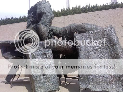
"Birth of Venus" is a bronze sculpture created by Reuben Nakian from 1963 to 1966, and was cast in 1969. It was based off a painting by the same name by Sandro Botticelli that was done circa 1486. The painting shows a woman, the goddess Venus, standing in an open shell. According to Roman mythology, Venus was born when she emerged from the sea as a grown woman. The Botticelli painting and the Nakian sculpture both incorporate this story, although the sculpture is much more abstract.
This sculpture is pretty interesting to look at because there are a lot of details. At first, it doesn't look like much is going on--it appears to be depicting just a pile of rocks or something. It is a really abstract sculpture, so it's hard to tell what it is exactly, but after looking at it for a while, it's easy to notice a lot of different things.
One of the first things I noticed was the color of the sculpture. It is made of bronze, so it is mostly brownish, but looking at it closer, there are a lot of greenish hues. These green hues stand out a lot more and are more noticeable later in the day when it is getting dark. In the afternoon when it is sunny, the sun reflects off the sculpture, making it look bright and shiny.
Another unique aspect of the sculpture is that it is made of several different sections and pieces that are all different. There are many levels and depths to the sculpture, but everything is connected. You can even see the bars that provide the framework for the sculpture at the bottom and behind it, almost like scaffolding. At first I wasn't sure if the bars were part of the sculpture or if they were just help to support it, but when looking at the back of the sculpture, I think they are mostly for framework. From the back of the sculpture, you can see that all the pieces are open and hollow, not enclosed and all the bars are clearly visible.
Among the different levels, there is a piece that is clearly above the rest of the sculpture. Because of this break in the alignment, there is a visual hierarchy in the sculpture. The viewer notices this part first, and this emphasizes the importance of this part. It appears to be "rising" out of the bottom part of the sculpture, and if compared to the painting, this part represents Venus that is coming from the water.
The texture of the sculpture is another important aspect of the art. It is very rough, and at first glance, it looks like it's made of bronze rocks. There are holes in the bronze all over the sculpture, and some of them look almost accidental, as if they're there as a result of the sculpture being outside for a long time. This gives "Birth of Venus" the appearance of being old and worn. It is not flawless art, but appears to be weathered and imperfect.
I haven't had a lot of extensive or recent experience with art objects, but I think I've had enough to have a basic background. The last art class I took was in elementary school and one of the projects we did was a model of the bike sculptures that were displayed throughout Lincoln as part of the Tour de Lincoln project. We also took field trips to the Sheldon every year in elementary school, and we spent a lot of time in the sculpture garden learning about the different pieces.
More recently, I've participated in a soap-carving contest that my dorm had. I started out making a fish, but it turned out to be a turtle that looked more like a dinosaur, so it ended up pretty terribly. It was fun though, and I got some experience making art. I also learned that soap is a difficult medium to work with because it's soft and breaks easily.
I think the main reason I haven't had a lot of experience working with art objects is that I've never really had an opportunity to do so. I was involved with music throughout high school, which filled up my schedule, so I never got to take an art class. I've always wanted to take a pottery class or something like that, but it has never worked out.
There will probably be some challenges in this writing project, seeing as I don't have a lot of knowledge on art or sculptures, but I don't think it will be too difficult. I'm not really apprehensive about anything because I think I know enough to be able to write a letter, and I should be able to look up any information I need to know that I don't know already. This project will be pretty interesting for me because it involves an area that I really haven't spent a lot of time working with but have wanted the chance to do so. I'm also glad to be doing something different than writing a typical rhetorical analysis.
As this was my second writing project of the year, I felt like I had a lot more experience and direction with this paper than with the first. This had some similar aspects to Writing Project 1, but instead of analyzing a photograph, this paper dealt with analyzing a comic strip. This posed some unique challenges because there were several new concepts to incorporate into my paper.
It was difficult to start this paper because I didn't have a lot of material to write about in my first draft. I was a little short of the minimum word count, so when working on my second draft I had to work to expand on what I had written. I added in specific examples of pathos and logos, and tried to make sure every paragraph supported my thesis. I also changed the introduction to my first body paragraph from "Watterson effectively appeals to his audience..." to "Calvin and Hobbes effectively appeals to the audience..." This was an improvement because the argument wasn't really about what the cartoonist was arguing, but it was about what the comic itself was arguing.
Also, after my first draft, I had to rework my thesis. Specifically, I changed my thesis from "Watterson embodies the idea that childhood is short and needs to be embraced through the universality of the comic, the relationship between Calvin and Hobbes, and the technical form of the comic strip itself. These elements work together to evoke pathos and logos in support of the argument," to "This particular comic makes the argument that childhood is short and needs to be embraced by evoking pathos through the universality of the comic, metaphors alluding to the fact that childhood eventually ends, and the logos of the technical form of paneling, drawing of the comic strip itself, and the outlining used," in my final draft. This new thesis was more specific and I think it allowed me to make my body paragraphs to better support the argument.
After my second draft, I didn't have as much to rework as after the first draft, but I still had to work on things. I deleted the paragraph about typeface because it didn't provide a strong support to the argument and it didn't really fit in with the rest of my paper. I also rearranged a couple of the body paragraphs dealing with the body language and the inside and outside activities to put these two paragraphs next to each other. I also included the concept of juxtaposition into these paragraphs to relate them to logos.
Throughout the revision process, I relied heavily on the comments from both peer reviews from Amberly and Kelli and from my instructor, Joshua. Without these comments, I would not have been able to improve my paper as much as I did. It helped a lot to have that outside perspective because other people have different ideas and suggestions that I would not have been able to come up with on my own.
I think the writing and editing process helped me a lot. I was able to better develop my writing into a polished final draft that is greatly improved from my first draft. It was not always easy to figure out what I should change when doing my rewrites, but it was a good experience because it helped me become a better writer.
Calvin and Hobbes is a comic strip created by Bill Watterson. It was first published in newspapers in November 1985, and was immediately popular, running through December 1995 (http://www.billwatterson.net/). The strip is about the adventures of six-year-old Calvin and his tiger, Hobbes. The characters are named for the reformation leader John Calvin and philosopher Thomas Hobbes, respectively, and embody some of the qualities of their namesakes. Calvin tends to challenge authority and insists on doing things his way, while Hobbes is overly realistic and serves as the voice of reason within the strip. Calvin also is very philosophical and has an unusually large vocabulary for a kid his age, which makes him seem more adult-like.
However, as the video shows, Calvin is also imaginative and rambunctious, just like any average six-year-old. This is made clear by the role of Hobbes. When Calvin and Hobbes are the only two characters shown in a panel, Hobbes is shown to be an anthropomorphic tiger. He can move and talk, and is Calvin's best friend. When there is another character in the panel, Hobbes is shown as just a stuffed tiger, raising the question if whether Hobbes is only a figment of Calvin's imagination. Because Calvin has both these childish tendencies and adult characteristics, he is an excellent representation of the inner child in everyone, something that contributed to the success of the strip.
In this comic, it shows Calvin complaining about doing his homework, and then eventually giving up to go play outside. In the last panel, Calvin says, "Childhood is short and maturity is forever," and this is the central argument of the strip. This particular comic makes the argument that childhood is short and needs to be embraced by evoking pathos through the universality of the comic, metaphors alluding to the fact that childhood eventually ends, and the logos of the technical form of paneling, juxtaposition of drawing of the comic strip itself, and the outlining used.
Calvin and Hobbes effectively appeals to the audience because this comic is something that a lot of people can relate to. Calvin is drawn as a simple, generic child. As stated in The Vocabulary of Comics by Scott McCloud, this abstraction works create to a more universal appeal, as more people are able to see themselves in Calvin, which supports the idea that Calvin represents people’s inner child. Also, Calvin does not look very realistic, but anyone would recognize him as a human child. Since Calvin is so simple, the audience pays more attention to the message he is giving than how he looks. This works to strengthen the overall argument by creating an emotional appeal to pathos with the audience because everyone was a child once and knows what that is like.
In addition to the universality of the drawings, the situation of the comic is something that appeals to a broad spectrum of people. Everyone old enough to read this comic has gone to school at some point, whether it is kindergarten or graduate school, and most people can relate to the feeling of not wanting to do homework. By putting off his homework to go play outside, Calvin does what the typical child would choose to do. This again embodies the inner child in the audience, because adults usually aren’t able to put off their work to go do something fun. This evidence works to preserve childhood and furthers the argument that childhood needs to be embraced.
Another element of the strip that works to preserve childhood is the role of Hobbes, the tiger, who is shown as a stuffed tiger that is as real as a human friend to Calvin. Hobbes is essentially an imaginary friend, which is another fundamental element of childhood. This appeals to the pathos of the audience because it is something that a lot of people can relate to, which creates an emotional connection between the audience and the characters in the comic. By making Hobbes a part of Calvin's imagination, it establishes the childishness of the strip. Since people eventually outgrow imaginary friends, Hobbes represents the idea that childhood is short because Hobbes, like childhood, will someday be outgrown. This metaphor directly reflects the argument of the comic: Hobbes, like childhood, must be taken advantage of while it is still there, before it is gone forever.
Besides the emotional appeals to pathos, the technical elements in the form of the comic strip provide appeals to logos. The comic is made up of three panels, which show the passing of time. In this particular strip, the third one is twice the size as the first two, and the visual arrangement appeals to logos. This organization visually establishes that the third panel is the most important of the three, since it is the one that contains the message that "childhood is short and maturity is forever." As the comic strip ends, it symbolizes that eventually childhood will end too. The third panel is another metaphor for the argument, as it shows that it is the main emphasis of the strip. The fact that the comic ends represents the finality of maturity. Again this emphasizes that childhood must be embraced before the finality of maturity and adulthood sets in.
The drawing of the comic itself creates an appeal to logos. The sled in the third panel appears to be flying, again adding to the sense that childhood has more freedom. When Calvin and Hobbes are free from the confines of sitting at a desk doing homework, they are visibly much happier, which is shown by their facial expressions and body language. While they are inside, the comic shows Calvin overwhelmed and unhappy in the first panel. This is reiterated in the second panel by showing the same scene from a different angle. As stated in Chapter 15 of Compose, Design, Advocate, we can relate to the body language because we have bodies that function in the same way as the characters' in the strip. The audience can relate to the level of frustration Calvin is feeling while he is stuck sitting at his desk doing homework, which provides another emotional appeal to pathos. This juxtaposition between the different panels supports the argument because by showing that childhood is more enjoyable, it emphasizes that is must be appreciated before one has to give in to the drudgery of adulthood.
Another appeal to logos made in the drawing of the comic is that the first two panels contain indoor scenes, and the third is an outdoor scene. This juxtaposition not only shows the different activities associated with childhood and maturity, but also represents the binary relationship between the two. Sitting inside and doing work is considered a more mature, "adult" activity, while sledding outside is more of a "kid" activity. Since these activities are shown in completely different settings, it shows the contrast between mature adulthood and carefree, fun childhood.
Furthermore, the form of the comic creates an appeal to logos. The first and third panels are outlined, while the second one is not. This creates a visual break, emphasizing the difference between the scenes. Also, the dialogue bubbles are the same way. They are outlined in the first and third panels, but not in the second one. This is a visual continuity with the outlining of the panels. By having the second panel not outlined, it makes the third one stand out, again emphasizing the importance of the final panel and it's message.
Through establishing pathos and logos, the universal appeal of Calvin and Hobbes, the role of Hobbes as a fundamental element of childhood, and the technical form of the comic strip, the argument is made that childhood is short and needs to be appreciated while it is still there. Though Calvin and Hobbes is not geared just toward children, the fact that this argument is made in a comic strip shows the true nature of the argument. By reading a comic in the first place, the audience is in fact embracing their inner-child, which is the whole point of the argument. Because childhood is short and maturity is forever, childhood needs to be taken advantage of while it can be. People have forever to be mature adults, but people only get to be kids once. This means that though childhood eventually ends, it is important to take time to live life.
 The sculpture I am using for Writing Project 3 is based on a painting by Sandro Botticelli with the same name, "Birth of Venus." The painting shows a woman, the goddess Venus, standing in a shell next to the ocean with angels flying around her. The painting depicts the myth that Venus was born when she emerged from the sea as a grown woman.